Strategy
SaaS UI/UX Design Audit: What Investors Notice Before You Do
Hiring a UI UX design agency India? Start with a SaaS UX audit: six checks investors and enterprise buyers notice first, and the costly gap to close.
Investors decide fast. DocSend's pitch deck research found that investors now spend less than three minutes reviewing a pitch deck. Your product demo, your dashboard screenshots and your website get the same compressed attention, from investors and from the enterprise buyers who follow them. A SaaS product that looks unfinished in those minutes raises a question nobody asks out loud: if the product looks like this, what does the code look like?
A UX audit answers that question before someone else does. It looks at your product and site the way a stranger does, scores what they see and ranks every fix by what it does for revenue. Founders often go looking for a UI/UX design agency in India to redesign the product. The better first step is finding out exactly what is wrong.
This guide will explain what a SaaS UX audit covers, what investors and enterprise buyers notice first, the UI laws the audit tests and how to choose a UI/UX design agency in India to run it.
Key Takeaways
A UX audit scores your product and website against how buyers and users actually decide, with evidence for every finding and fixes ranked by impact.
Investors and enterprise buyers notice clarity, consistency, speed and polish in the first minutes. They rarely tell you what put them off.
SaaS dashboard design fails when every metric gets equal weight. Hierarchy decides whether a user finds the one number that matters.
Measure what can be measured: Core Web Vitals, contrast ratios, clicks to key actions and task completion.
Before hiring a UI/UX design agency in India, ask for a scored audit with annotated screenshots. Opinions without evidence are not an audit.
What is a UX audit for a SaaS product?
A UX audit is a structured review of a product or website against usability principles, the buyer's decision process and measurable standards. A good user experience audit ends in a ranked list of problems, each with a screenshot, the evidence and a proposed fix. A weak one ends in a list of opinions about colours.
For SaaS companies, the audit has two surfaces: the marketing site that sells the product and the product that has to deliver on the promise. Audits often cover only one. A UX design audit that covers both catches the costly gap between them, covered further down.
What do investors and enterprise buyers notice first?
They notice the same things users notice, with less patience. Six signals do most of the damage.
Whether the first screen explains the product. If a stranger cannot say what the product does and who it is for within five seconds, the rest barely matters. Our post on the five-second test covers how to check this.
Whether the dashboard has a point. A screen with twelve equal-weight charts suggests the team has not decided what matters.
Whether things look like one product. Buttons, spacing and type that change from screen to screen suggest a product assembled in a hurry.
Whether it is fast. Slow screens read as technical debt, fairly or not.
Whether everyone can use it. Low contrast and unlabelled forms signal a product that has not met an enterprise accessibility review.
Whether empty and error states were designed. A blank table or a raw error message shows where design stopped.
None of these requires a redesign to spot. Each can be found, scored and ranked in an audit, which is why the audit comes before any quote to redesign.
How does a SaaS UX audit work, step by step?
Whichever UI/UX design agency in India you choose, ask how the audit is structured. Ours runs in six phases, and each one produces evidence for the report. Every finding comes with a screenshot and a fix, and the whole audit is scored out of 100 so you can track progress after changes ship.
| Phase | What we check | Evidence we look for |
|---|---|---|
| 1. ICP fit | Does the site and product speak to the buyer who signs and the user who logs in? | Headlines, onboarding copy and dashboard labels read against the buyer map |
| 2. User flow | Can a user reach the key action without detours? | Clicks to key actions, dead ends, loops |
| 3. Colour | Is colour doing a job, and does it pass contrast? | Contrast ratios, one colour reserved for actions |
| 4. UI laws | Do layouts respect how people process choices and targets? | Choice counts, target sizes, grouping |
| 5. Trust and conversion | Is proof next to the ask? Are security and pricing questions answered? | Placement of proof, pricing clarity, security page |
| 6. Tech and accessibility | Speed, stability and WCAG basics | Core Web Vitals, keyboard access, labels, alt text |
The output is a scored report, annotated screenshots and a competitor gap table. The audit is useful on its own. Teams with in-house designers often take it and fix everything themselves, which is a good result.
Which UI laws does the audit test?
The laws that explain most usability failures are old and well tested. Hick's law comes from Hick's 1952 experiments on choice and reaction time, which found that decision time grows with the amount of information a person has to process. Every extra navigation item and every extra button slows the decision. Our post on Hick's law for B2B websites shows how to cut choices without losing anything important.
Fitts's law comes from Fitts's 1954 motor study, which showed that the time to hit a target depends on distance and size. Small, distant buttons get missed, especially on phones. Jakob's law adds a practical rule: people spend most of their time on other products, so they expect yours to work the same way. Break conventions only where you gain something.
What makes SaaS dashboard design so hard?
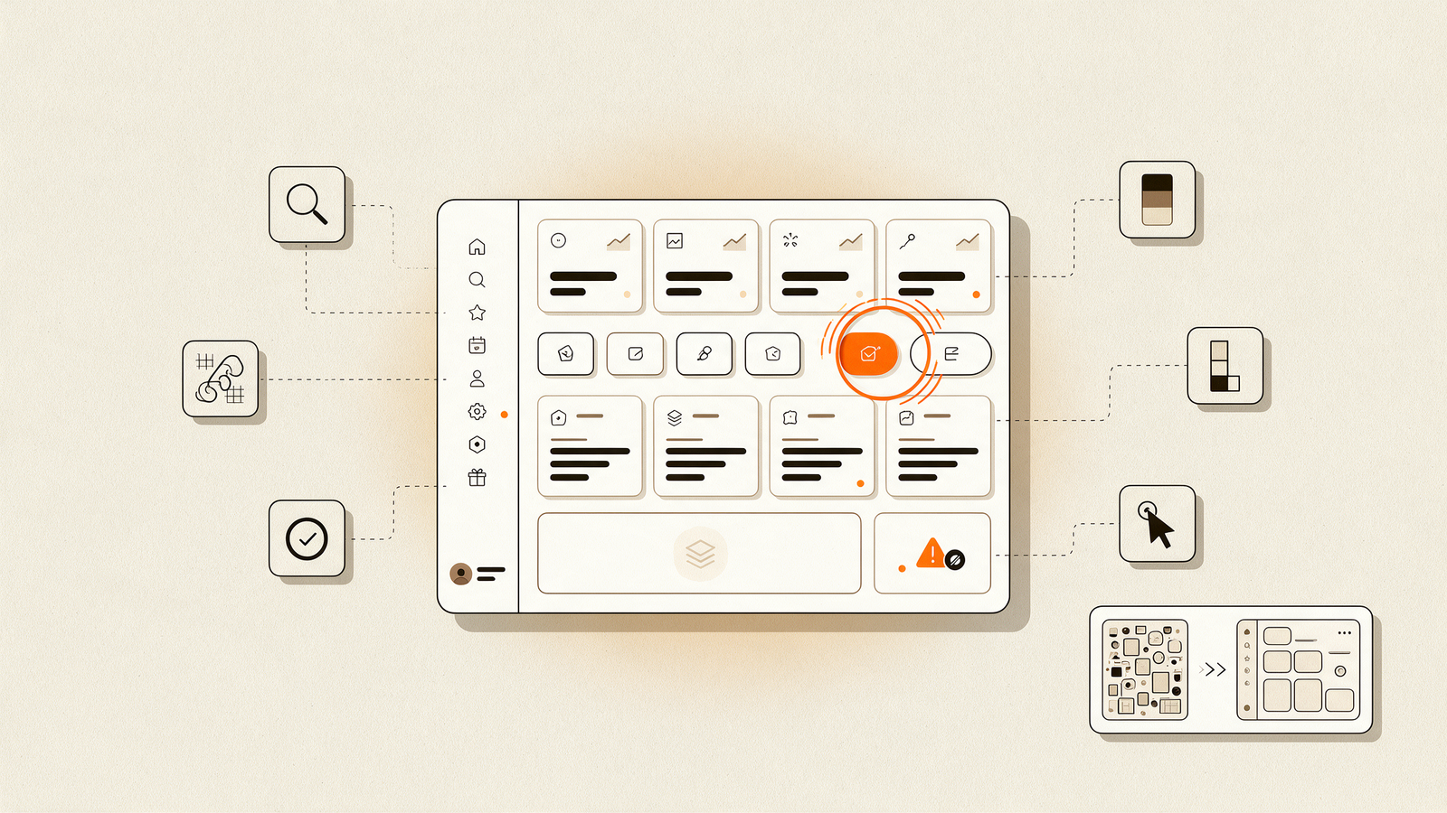
Dashboards collect every metric someone once asked for, and nobody removes any. SaaS dashboard design fails when the screen gives every number equal weight, because the user then has to decide what matters on every visit. Good SaaS dashboard UI puts the one question the user logs in to answer at the top, groups related numbers and pushes the rest one click away.
The usual cause is skipped research. McKinsey's design research found that over 40% of the companies it surveyed were not talking to end users during development. A dashboard designed without watching users becomes a list of features. A dashboard designed after five user interviews often ends up as three numbers and a trend.
Which numbers should a UX audit report?
Opinions start arguments. Numbers end them. A useful UX audit reports these alongside the qualitative findings.
| Measure | Target | Why it matters |
|---|---|---|
| Largest Contentful Paint | 2.5 seconds or less | How fast the main content appears |
| Interaction to Next Paint | 200 milliseconds or less | How quickly the product responds to a click |
| Cumulative Layout Shift | 0.1 or less | Whether the layout jumps while loading |
| Text contrast | WCAG AA: 4.5:1 for body text | Readability for every user, and enterprise reviews |
| Clicks to key action | As few as the task allows | Every extra step loses users |
| Audit score | Out of 100, re-scored after fixes | Shows progress in one number |
The speed targets are Google's Core Web Vitals, measured at the 75th percentile of page loads. Contrast is the most common failure we expect to find. WebAIM's 2026 Million report detected low-contrast text on 83.9% of the top one million home pages and missing form labels on 51%. Our free 20-point website check covers the basics if you want to start alone, and our guide to WCAG compliance for B2B websites covers the standard in full.
What is the costly gap between your website and your product?
It is the moment a buyer moves from the marketing site into the product and it feels like a different company. The site promises clarity and speed. The product shows dense tables, inconsistent buttons and a different colour palette. Investors and enterprise buyers see both in the same afternoon, and the gap undermines the promise the site just made.
Any UI/UX design agency in India you hire should check this gap first, and closing it does not require a full rebuild. Shared type, colour and component rules across site and product, plus a redesigned first screen after login, remove most of the dissonance. For companies preparing a raise, our guide to investor-ready startup website design covers the site side, and assistants now read both surfaces too, as our answer engine optimization guide explains.
How do I choose a UI/UX design agency in India for an audit?
Ask for evidence before you ask for a price. A UI/UX design agency in India worth hiring for an audit will show you a sample report with scored findings, annotated screenshots and fixes ranked by impact. Many product design companies in India lead with visual portfolios, which show taste and say little about diagnosis.
Does the audit cover the site and the product? The gap between them is often the biggest finding.
Is every finding backed by evidence? Screenshots, measurements and a named principle.
Are fixes ranked by impact and effort? A flat list of 60 issues is homework. You need an order.
Do they design dashboards? A SaaS UI UX design agency should show dashboard and onboarding work, beyond marketing pages.
Can you act on it without them? A good audit is useful even if you never hire the team that wrote it.
Our UI/UX design work starts with exactly this audit, then moves through flows, wireframes, high-fidelity UI and a design system handed over with dev-ready specs. You get the Figma files and own every component.
Frequently Asked Questions
What is a UX audit?
A UX audit is a structured review of a product or website against usability principles, the buyer's decision process and measurable standards such as speed and accessibility. It produces a ranked list of problems with evidence and fixes, so a team knows what to change first and why each change matters.
How long does a UX audit take?
It depends on the size of the product and how many user flows need testing. A homepage review can take a day or two, and a full audit of a site and product takes longer. Ask for a fixed scope before starting so the timeline and the deliverables are agreed in writing.
What is the difference between a UX audit and usability testing?
A UX audit is an expert review against principles and measurements, done without recruiting users. Usability testing watches real users attempt tasks. Audits are faster and cheaper, and they find the obvious problems. Testing finds the surprising ones. Mature teams run an audit first, then test the flows the audit flags as risky.
What should SaaS dashboard design prioritise?
Good SaaS dashboard design starts from the single question a user logs in to answer. Put that number or status at the top, group related metrics beneath it and move rarely used data one click away. Design empty and error states too, because new accounts see empty dashboards first and judge the product on them.
Do investors really look at product design?
Investors assess the team, the market and traction first. Product design shapes how credible that story feels in a demo, and a product that looks unfinished invites questions about execution. Enterprise buyers who follow the investment look even more closely, since their teams have to use the product daily.
Should the same team audit and redesign the product?
It can, provided the audit stands on its own. A good audit is useful even if you never hire the team that wrote it, and the findings should be specific enough for an in-house designer to act on. Be wary of an audit that only recommends buying a full redesign.
Start with the audit
A redesign built on guesses changes how the product looks and leaves the real problems in place. A UX audit tells you what investors, buyers and users actually hit, measures it and ranks the fixes by what they are worth. Run one before you brief any UI/UX design agency in India, and you will know exactly what you are paying to fix.