Felicidade · Wellbeing
A wellbeing app that had to sound like a friend, not a clinic
Mental health support for a gen-Z audience in India, where the wrong tone loses the user before the product gets a chance.
The brief
What they came to us with
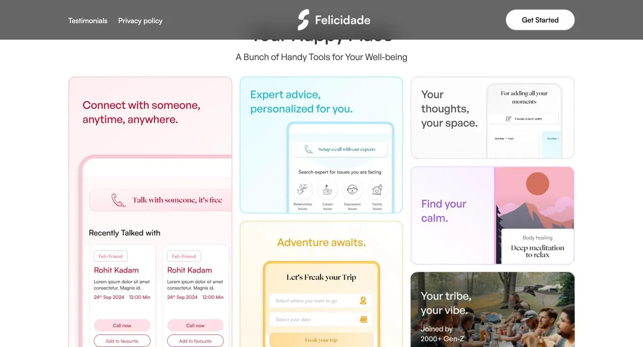
Felicidade is a wellbeing platform for a gen-Z audience in India, combining community, access to qualified experts, journalling and a companion feature called Feli-Friend. The marketing site has to get someone to sign up for something people in this market are often reluctant to admit they need.
What the audit found
What was broken
- Finding 01
Mental health still carries stigma in this market
A product presented as therapy or treatment meets resistance before it is understood. The framing has to make reaching out feel ordinary rather than clinical, without pretending the serious part is not there.
- Finding 02
Gen-Z detects marketing instantly
Polished corporate wellbeing language reads as inauthentic to this audience and gets dismissed faster than it gets read. The voice has to be peer-level while still carrying enough credibility to be trusted with something personal.
- Finding 03
Two very different promises in one product
Community and friendship pull toward lightness. Qualified experts and data privacy pull toward seriousness. Lean too far either way and the product either feels unserious or feels like a hospital.
The approach
What we did
Strategy first, then design, copy and build moving together from the same plan.
- Strategy
Lead with belonging, let the clinical part follow
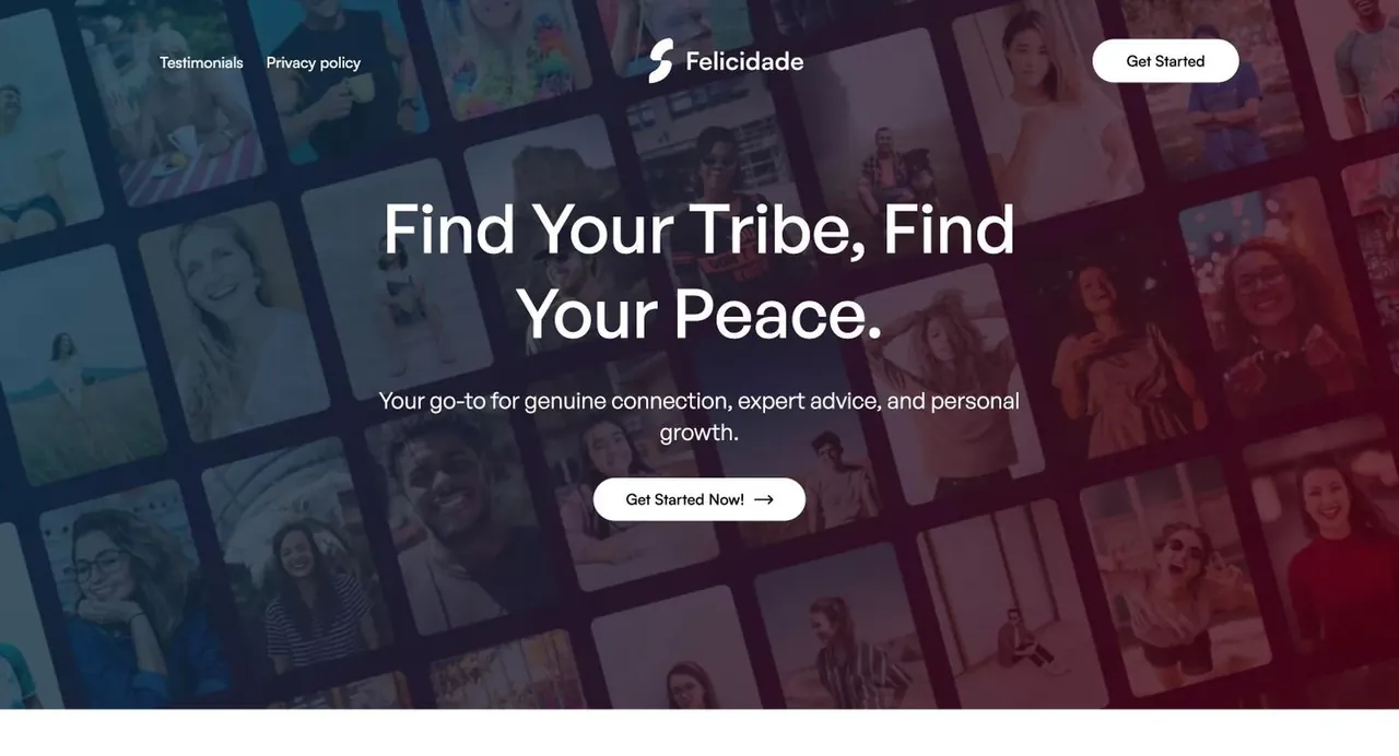
Find Your Tribe, Find Your Peace puts connection first and calm second. The supporting line then widens it to genuine connection, expert advice and personal growth, so the qualified help is present from the first screen without being the opening pitch.
- Content
Write at peer level, not provider level
Your happy place. A bunch of handy tools for your well-being. You got questions, we got answers. The register is deliberately informal, which is the difference between an app a nineteen-year-old opens and one they screenshot to mock.
- UI/UX
Replace the signup wall with a conversation
Onboarding asks name, date of birth, location, occupation and how often you feel stressed or anxious, framed as let's get to know you better so we can support your journey. The same questions as a form, but positioned as the start of being helped rather than a gate to get past.
- Content
Put the hard questions in the FAQ and answer them plainly
Is my personal data safe. Are the experts qualified. Can I cancel anytime. Is it free. These are the real blockers for someone deciding whether to share something private, and burying them would cost signups.
- Strategy
Name the companion feature
Feli-Friend gives the AI companion an identity rather than calling it a chatbot. For an audience that will not say I need therapy, a named friend is a far lower-friction first step, and the FAQ explains how it works for anyone who wants the mechanics.
- UI/UX
Keep one action, repeated
Get started now in the hero, get started mid-page, join Felicidade now at the close. One decision, offered at three points of readiness, with no competing secondary paths to dilute it.
Before and after
Drag to compare
Left is where they started. Right is where they are now.
Close your books in 2 days, not 12.
Ledgerly reconciles bank, cards and invoices automatically, so month-end stops eating your team.
Empowering Next-Gen Synergies With AI-Driven Innovation
We are a leading provider of cutting edge, best-in-class, end-to-end solutions for the enterprises of tomorrow, today.
The positioning decision worth stealing from this one is using community as the front door to clinical support. The expert help is the substance, but asking a reluctant user to start there is asking too much. Starting with belonging gets them in, and the qualified help is waiting once they are.
From the project