LIVO · Property management software
Software for people too busy to evaluate software
A UAE property management platform sold to managers whose phones do not stop ringing.
The brief
What they came to us with
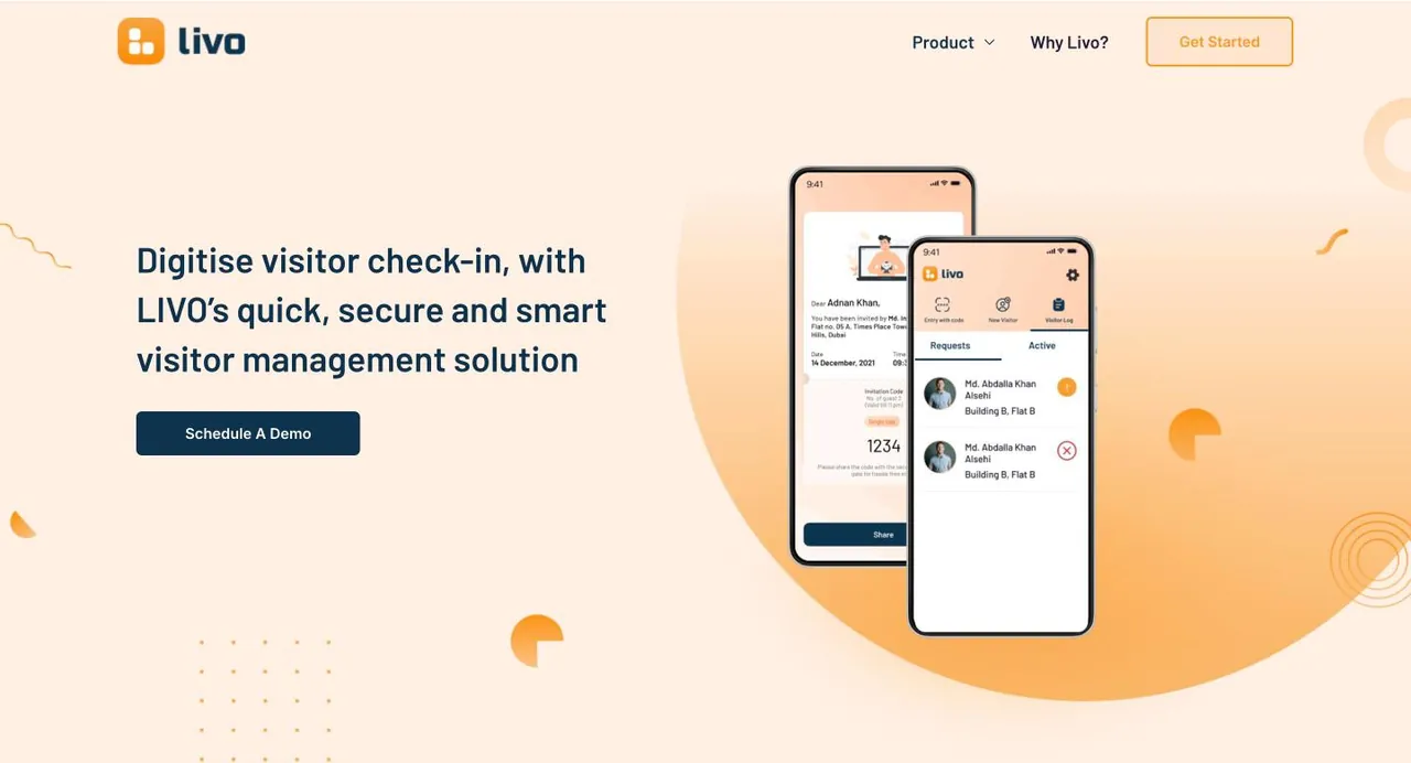
LIVO is a digital platform for property and community management in the UAE, covering rent collection, maintenance requests, visitor management, community interaction and staff oversight. It sells to property managers running residential portfolios, and the residents of those buildings are the second set of users.
What the audit found
What was broken
- Finding 01
The buyer has no time to be sold to
A property manager's day is interruptions: calls, maintenance escalations, payment chasing. Any site that requires patience to understand loses them. The pitch has to land in one screen or not at all.
- Finding 02
The category is crowded with lookalike feature lists
Property management tools all list the same modules. A feature grid alone gives a buyer no reason to pick one, so the site has to lead with the outcome instead.
- Finding 03
Two audiences again, with different stakes
The manager buys it. Residents live with it. A platform that annoys residents creates more calls for the manager, not fewer, so resident experience is part of the business case rather than a nice extra.
The approach
What we did
Strategy first, then design, copy and build moving together from the same plan.
- Strategy
Name the buyer in the headline
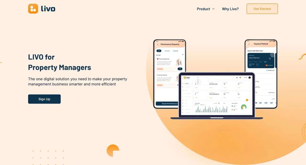
LIVO for Property Managers, followed by the one digital solution you need to make your business smarter and more efficient. No ambiguity about who it is for, which matters in a category where tools are often sold to landlords, developers and managers with the same page.
- Content
Open on the daily reality, not the product
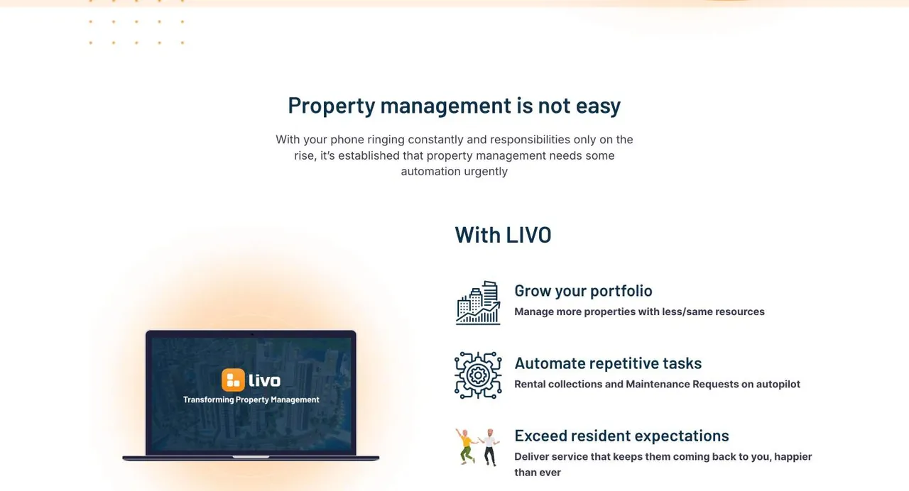
A section titled property management is not easy describes the phone ringing constantly and responsibilities only rising. Agreement comes before persuasion. The reader sees their own week described before they are asked to consider anything.
- Content
Write three outcomes, not thirty features
Grow your portfolio, manage more properties with the same resources. Automate repetitive tasks, rent collection and maintenance on autopilot. Exceed resident expectations. Each pairs a business outcome with the mechanism that delivers it, so neither reads as a slogan.
- UI/UX
Collapse the feature list into one idea
Payment management, maintenance requests and rich insights are presented as multiple functions, one platform. For a manager currently juggling several tools and a WhatsApp group, consolidation is the actual value, and the structure says it before the copy does.
- Strategy
Make resident experience part of the sale
Visitor management, community interactions and staff management are framed as value-added offerings. Visitor management is described as convenience without compromising security, which is the exact tension a manager has to hold with residents and with building owners.
- Content
Answer procurement quickly and move on
Why choose us is five short lines: strong technology stack, easy to set up, budget friendly, strong privacy and security, 24x7 support. Ease of setup and support are the two things that actually decide this purchase, because the buyer has no appetite for an implementation project.
Before and after
Drag to compare
Left is where they started. Right is where they are now.
Close your books in 2 days, not 12.
Ledgerly reconciles bank, cards and invoices automatically, so month-end stops eating your team.
Empowering Next-Gen Synergies With AI-Driven Innovation
We are a leading provider of cutting edge, best-in-class, end-to-end solutions for the enterprises of tomorrow, today.
The sharpest structural decision is putting the problem section before the product section. Most software sites in this category open with the dashboard. Starting with the ringing phone earns the right to show the dashboard, and it costs one screen to do.
Worth noting for anyone reading our own portfolio: this project is listed in our records as a super-app, which is not what the live product is. It is property and community management software. The description has been corrected here rather than carried forward.
From the project