BigYellowFish · Workforce risk and wellbeing
Turning wellbeing software into an operations purchase
A frontline platform that had to stop sounding like an HR perk and start sounding like risk management.
The brief
What they came to us with
BigYellowFish is a frontline success platform for operational resilience, built around health and wellbeing, communication and engagement, and social belonging. It sells into organisations running critical operations, where the people using it are frontline workers and the people buying it sit in operations, safety and HR leadership.
What the audit found
What was broken
- Finding 01
Wellbeing reads as a nice-to-have, and nice-to-haves lose budget fights
Anything presented as employee wellbeing competes for discretionary spend and gets cut first. The same product presented as operational risk competes against incidents, absenteeism and insurance claims, which have owners and budgets.
- Finding 02
The buyer and the user are different people with opposite needs
An operations director needs a defensible business case. A frontline worker needs something that takes seconds on a phone, often without a desk or a company email address. One site has to serve both without diluting either.
- Finding 03
Belonging and culture are hard to make concrete
The weakest part of this category is vague language about engagement. Without something measurable attached, it reads as decoration.
The approach
What we did
Strategy first, then design, copy and build moving together from the same plan.
- Strategy
Reposition from wellbeing to operational resilience
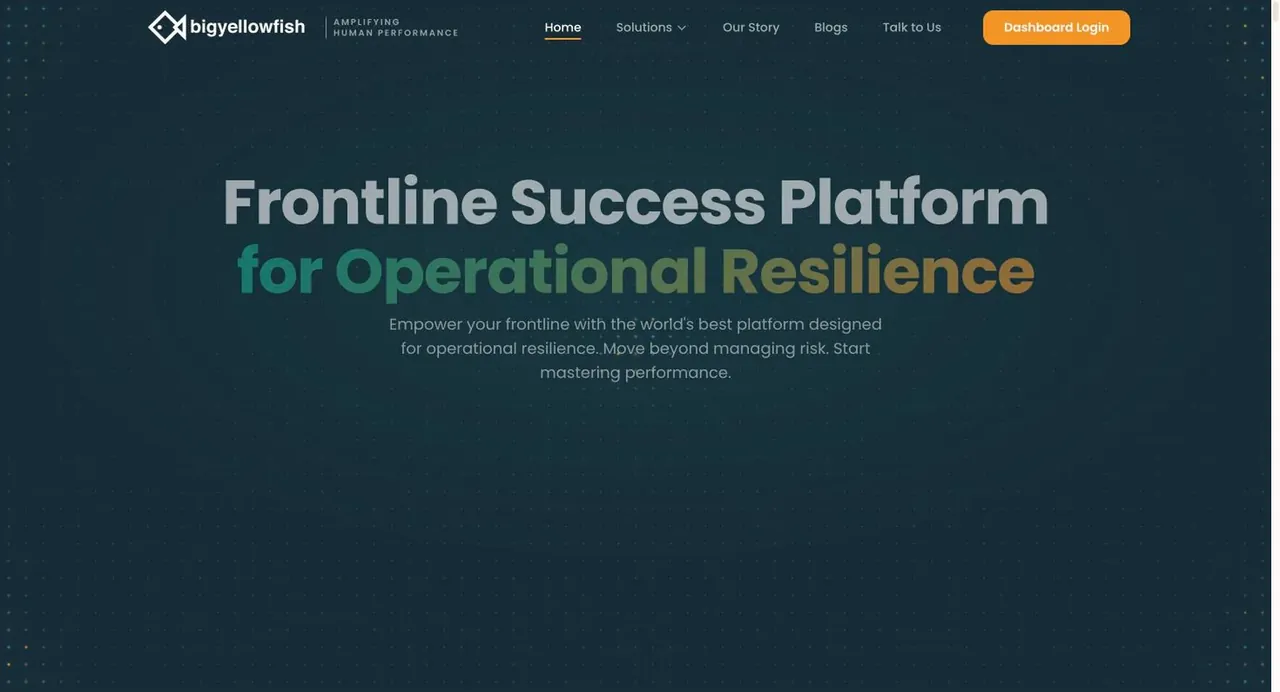
The headline is 'Frontline Success Platform for Operational Resilience' and the subhead says move beyond managing risk, start mastering performance. The vocabulary throughout is risk identification, risk intelligence and risk mitigation. Same product, a budget line that already exists.
- Content
Put the business case in the first screen
Three numbers sit directly under the hero: 21% higher productivity, 25% lower absenteeism, 15% fewer claims. These are the three things an operations leader is measured on, stated before any feature. The claims section matters most, because insurance cost is the line a CFO recognises without translation.
- Content
Organise around moments rather than modules
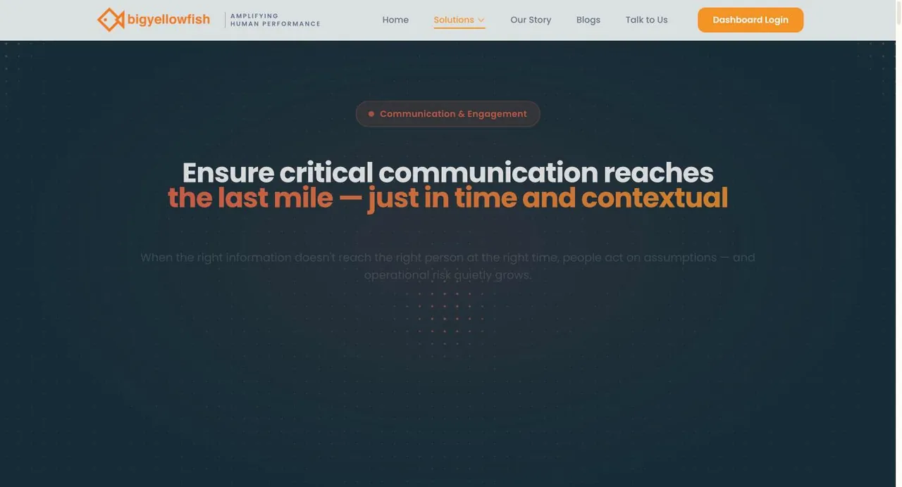
The site frames three critical moments: before work begins, while work is happening, and when things need attention. A reader who runs shifts recognises their own day in that structure, where a module list would have needed translating.
- UI/UX
Make the abstract measurable
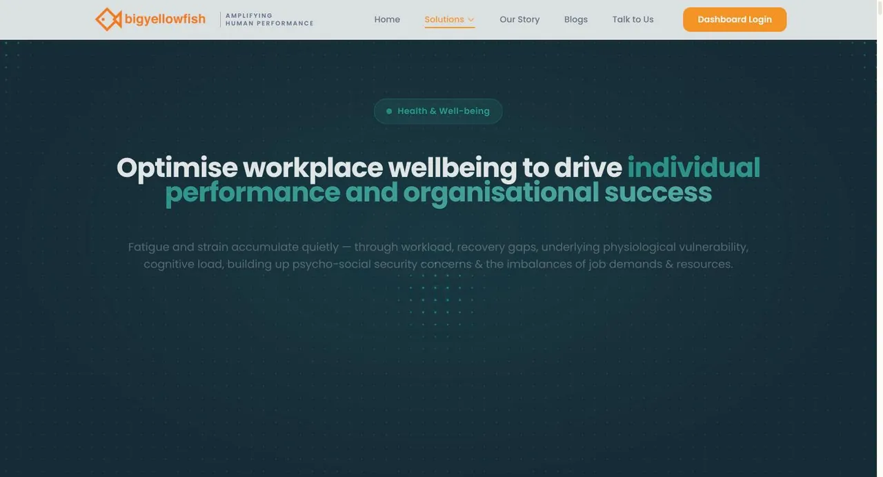
Each of the three solutions carries a concrete metric rather than an adjective: a human performance index scored out of ten, safety alert reach at 100% acknowledged within fifteen minutes, social engagement at 87% active participation. Belonging stops being a feeling and becomes a number someone can be accountable for.
- Strategy
Answer the hardest adoption question openly
A frictionless channels section names WhatsApp, mobile app, web, TV and Chromecast, ERP integration and an API. For a frontline workforce, reach is the entire problem, and naming WhatsApp and a TV screen says the team has thought about people who do not sit at computers.
- Content
Ground the method
The technology section names behavioural science and nudge mechanics, established risk management frameworks, gamification and AI that works in the background without replacing human judgement. That last qualifier is doing real work with a safety-conscious buyer.
Before and after
Drag to compare
Left is where they started. Right is where they are now.
Close your books in 2 days, not 12.
Ledgerly reconciles bank, cards and invoices automatically, so month-end stops eating your team.
Empowering Next-Gen Synergies With AI-Driven Innovation
We are a leading provider of cutting edge, best-in-class, end-to-end solutions for the enterprises of tomorrow, today.
The enterprise certification row (SOC 2, ISO 27001, ISO 9001, ISO 14001, GDPR, Class NK) is placed at the end rather than the top, which is the right call here. Class NK in particular signals maritime, and a reader from shipping will spot it. For a platform collecting data about individual workers, compliance is a gate, but it is a gate that opens after interest rather than before it.
From the project