Homeitup · Interior design
An interiors site built to get a phone number, not to win awards
Bangalore interior design, where the whole job is turning a browsing homeowner into a consultation.
The brief
What they came to us with
Homeitup is an interior design studio in Bangalore covering full home interiors, modular kitchens, master bedrooms, kids' rooms and pooja units. The customer is a homeowner, usually mid-project on a new flat or a renovation, comparing several studios at once and nervous about cost and reliability in roughly equal measure.
What the audit found
What was broken
- Finding 01
Every competitor shows beautiful rooms
Photography is table stakes in interiors. A gallery alone does not separate one studio from the next, because the next site has an equally good gallery. Something other than the images has to carry the decision.
- Finding 02
The customer's real anxiety is process, not aesthetics
Homeowners worry about being over-quoted, about timelines slipping and about losing control once work starts. Those fears rarely appear on interior design websites, which are usually built as portfolios.
- Finding 03
The enquiry has to happen on a phone, mid-scroll
This audience browses on mobile, often in the evening, often comparing tabs. If capturing interest requires finding a contact page, the interest is gone.
The approach
What we did
Strategy first, then design, copy and build moving together from the same plan.
- Content
Make the process the differentiator
A six-step sequence runs across the page: meeting, designing, get quote, production, installation, move in. Naming the quote as its own visible step is the key decision. It tells a nervous homeowner that pricing is a defined moment in the process rather than something that emerges later.
- UI/UX
Put the capture form in the hero
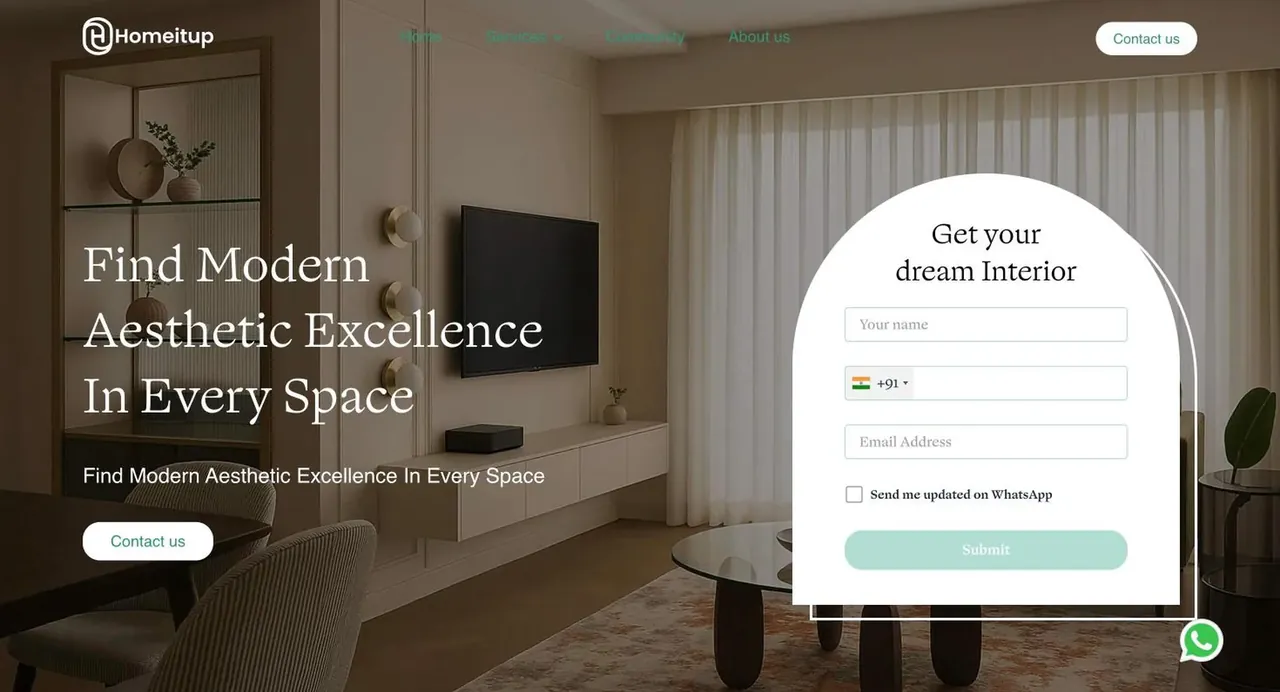
A short get your dream interior form sits in the first screen with a phone field and a WhatsApp opt-in, rather than waiting for a contact page. For this market, WhatsApp is the channel people actually reply on, and asking for it explicitly is more honest than collecting an email nobody will open.
- UI/UX
Split by room, because that is how people shop
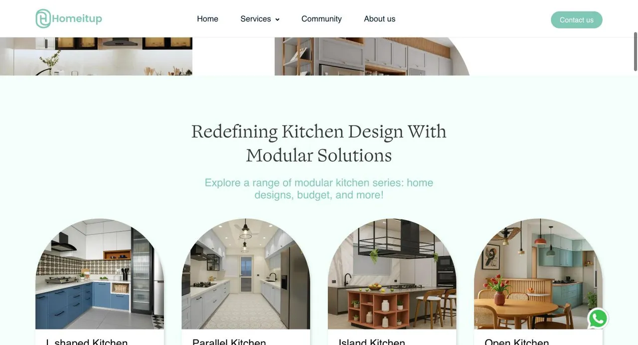
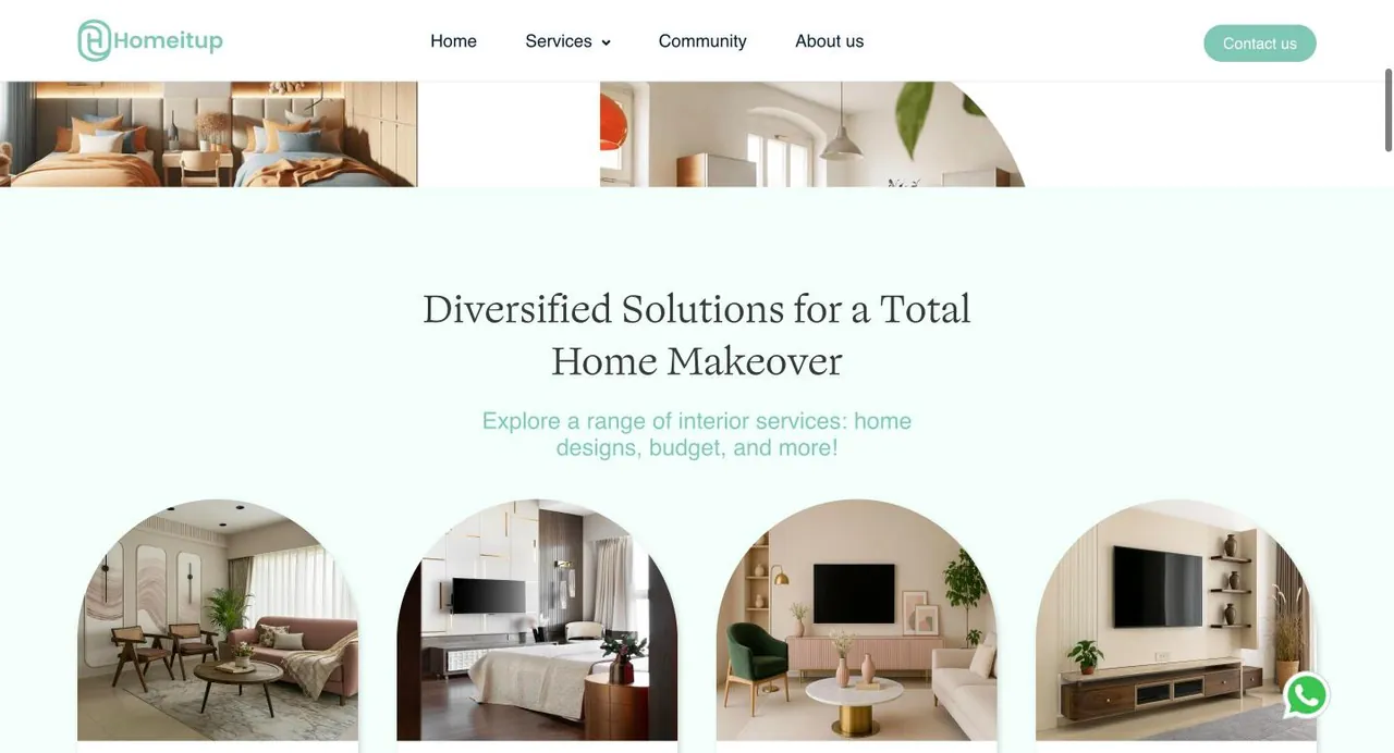
Services are broken into modular kitchens, master bedrooms, kids' bedrooms, full home interiors and a divine pooja unit. Homeowners arrive with a specific room in mind, not a whole-home brief, so the entry points match the thought they walked in with.
- Strategy
Keep the pooja unit first and unapologetic
Leading the service list with a pooja unit is a local signal that a generic template would have buried or omitted. For a Bangalore homeowner it says this studio designs for how the family actually lives, which is a stronger trust cue than another kitchen render.
- Content
Use testimonials that name the fear
The quotes chosen talk about a small apartment made to feel spacious, and a kitchen redesign made stress-free and fun. Both answer anxieties rather than praising taste, which is what a hesitant reader needs to hear.
- Content
Use the FAQ to handle objections, not logistics
Questions cover when to hire a designer relative to the contractor, what makes Homeitup different, and how material and craftsmanship quality is assured. These are the three things a homeowner is actually weighing, placed where a comparison shopper will look for them.
Before and after
Drag to compare
Left is where they started. Right is where they are now.
Close your books in 2 days, not 12.
Ledgerly reconciles bank, cards and invoices automatically, so month-end stops eating your team.
Empowering Next-Gen Synergies With AI-Driven Innovation
We are a leading provider of cutting edge, best-in-class, end-to-end solutions for the enterprises of tomorrow, today.
The strategic shift here is simple to describe and easy to get wrong: an interiors website is usually built as a portfolio, and this one is built as a funnel. The images still carry the quality signal, but the structure is organised around moving someone from looking to booking a free consultation, with the process laid out in between to make that step feel safe.
From the project